
All of Aurora’s design settings live in the WordPress Customizer. This page maps every panel to what it controls so you can find any setting quickly.
To open the Customizer, go to Appearance → Customize in your WordPress dashboard.
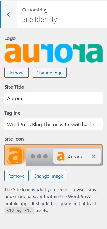
Site Identity
Upload your site logo, set your site title and tagline, and upload a site icon (favicon). Aurora uses the site title as a text fallback when no logo image is set.
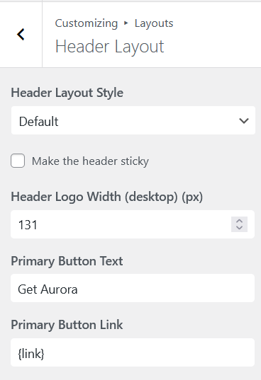
Header Layout
Controls everything about your site header:
- Header Layout Style — select from 8 header designs (6 horizontal, 2 vertical)
- Sticky Header — toggle to keep the header fixed as visitors scroll (horizontal layouts only)
- Smart Hide — only available if sticky header is enabled. This lets your header reappear/disappear on scroll
- Logo width — set independent pixel values for desktop, tablet, and mobile
- CTA Buttons — configure up to 2 call-to-action buttons with custom labels and URLs
- Header JavaScript — add custom JS to inject into the page
<head>
Homepage Style
Controls the layout and content of your homepage:
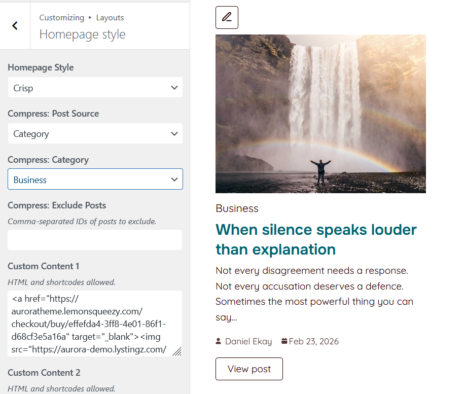
- Homepage Style — select from 5 designs
- Post Sections — configure the source (category, tag, or specific posts) and manually include or excluded posts for each section in the active layout. Click on a section’s pencil to access settings
- Custom Content Areas — inject HTML or shortcodes into the 4 available slots between post sections
Single Post Layout
Controls the design of individual post pages:
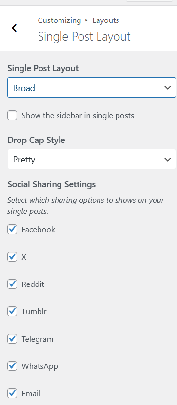
- Single Post Layout — select from 10 designs
- Drop Cap — choose a drop cap style for the first letter of post content (None, Bold, Casual, Pretty)
- Share Buttons — enable or disable share buttons per platform (10 platforms supported)
- Sidebar — toggle sidebar visibility on single posts
Archive Layout
Controls category, tag, date, and search archive pages. The post style here also affects the search and author pages:
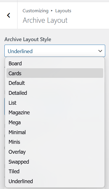
- Archive Layout Style — select from 13 designs
- Masonry — toggle masonry grid (available on 6 of the 13 layouts)
- Post per page — decide how many posts to show at once on archives
- Show More Posts — switch between numbered pagination and an AJAX Load More button
- Sidebar — toggle sidebar visibility on archives
- Archive Banner — choose between a Classy banner, a minimal one, or none at all. You can also change the alignment of the page title and breadcrumbs within the Classy banner
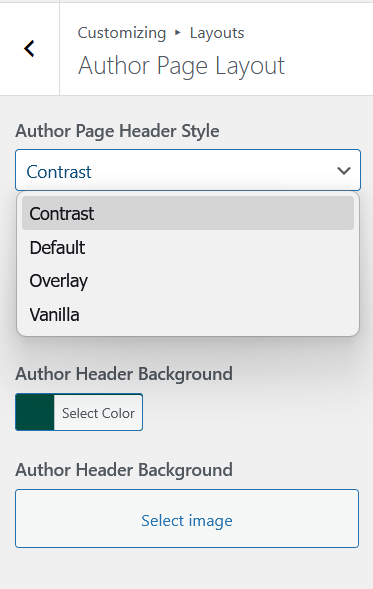
Author Page Layout
Controls the author profile page header layout. Select from 4 designs that vary in banner style and avatar treatment. You can also set a background color and an image background depending on the style you choose. Posts are displayed below the author block using the archive design and post per page settings configured under Archive Layout.
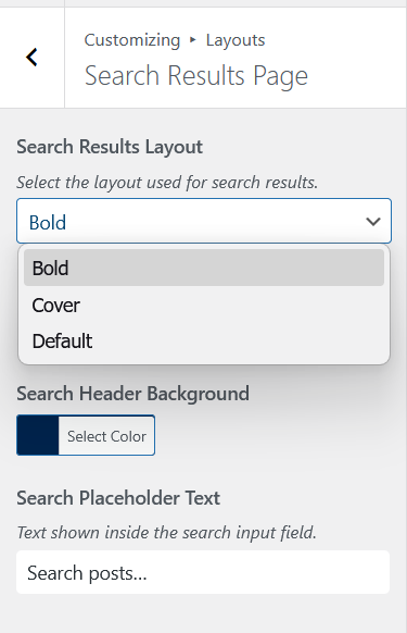
Search Results Page
Controls the search results page. Select from 3 designs that vary in hero banner style and search form placement. Post results are displayed here matching the archive design and post per page settings you make in Archive Layout.
404 Page Style
Controls your 404 error page:
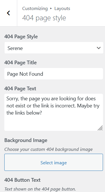
- 404 Page Style — select from 5 designs
- Title and body text — set custom messaging for the error page
- CTA Button — add a button with a custom label and URL
- Background Image — set a custom background for layouts that support it
- 404 Menu — assign a navigation menu to the 404 page
Footer Layout
Controls everything about your site footer:
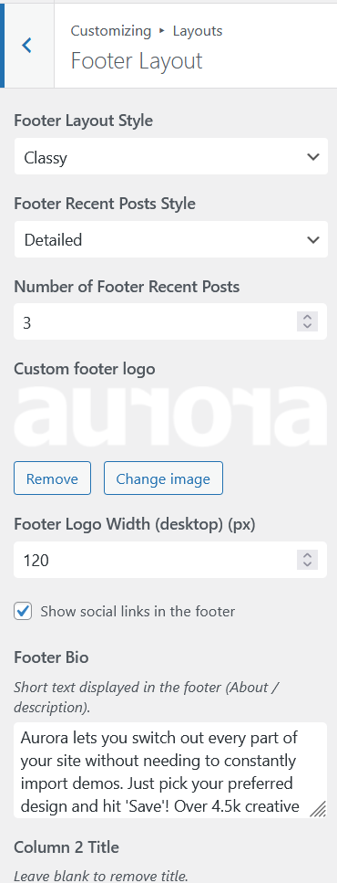
- Footer Layout Style — select from 5 designs
- Footer bio — the description text displayed in the first footer column
- Footer column titles — custom headings for menu columns 2, 3, and 4
- Recent posts style — for layouts that show recent posts in column 4.
- Footer socials — decide whether you want to show social icons in the footer
- Logo — upload a separate footer logo and set independent width values for desktop, tablet, and mobile
- Copyright text — custom copyright line in the footer bottom bar
- Footer JavaScript — add custom JS to inject before the closing
</body>tag
Colors
Controls every color value used across the theme. All values output as CSS custom properties and apply in real time. See Aurora Color System for the full reference.
Typography
Controls fonts for four independent categories: Body, Headings, Menu, and Buttons. Each category supports font family, size*, weight, style, line height*, letter spacing*, word spacing*, transform, and decoration. See Aurora Typography System for the full reference.
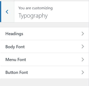
The starred properties* allow responsive settings. You can toggle the customizer preview to set independent settings for various screens
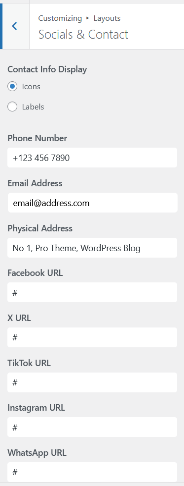
Socials & Contact
Central location for all social media URLs and contact information. Enter these once and Aurora displays them wherever the active layout calls for them in your header or footer blocks.
General Settings
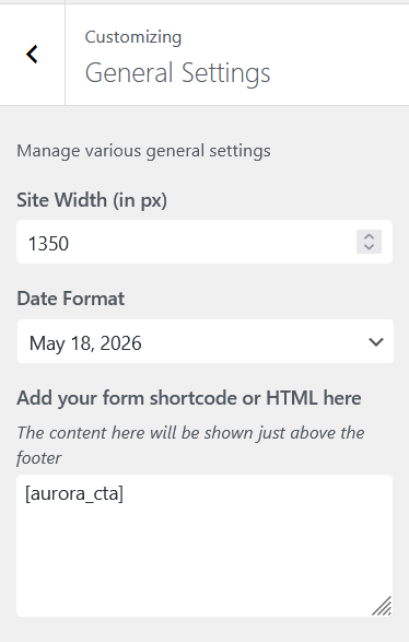
- Site width — sets the maximum content container width in pixels. Default is 1300px
- Date Format — choose from preset formats or enter a custom PHP date string
- Newsletter — paste any newsletter embed code or shortcode here. Aurora renders it as a full-width section above the footer on every page