
Footer
 By Daniel Ekay
•
Jun 16, 2026
•
By Daniel Ekay
•
Jun 16, 2026
•
How to Control Footer Logo Width on Desktop, Tablet, and Mobile
 By Daniel Ekay
•
Jun 16, 2026
•
By Daniel Ekay
•
Jun 16, 2026
•
Last updated:
Aurora’s footer logo has its own set of responsive width controls, independent from the header logo. You can set a different size at each screen breakpoint so the logo scales down gracefully on smaller devices.
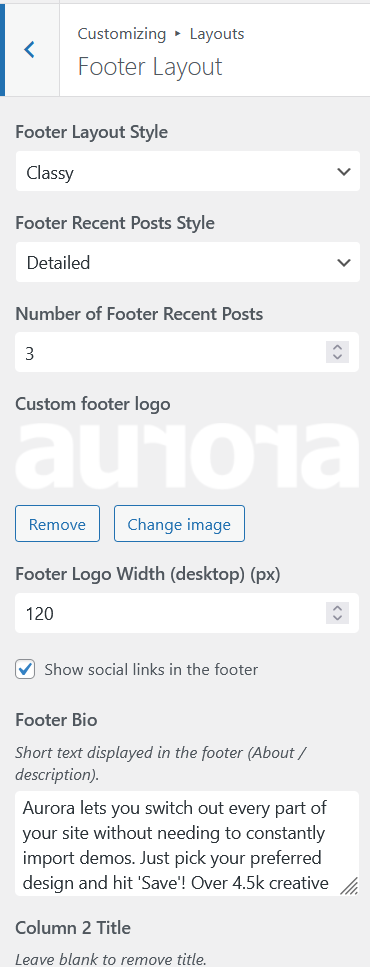
Where to Find the Settings
- Go to Appearance → Customize.
- Open Layouts → Footer Layout.
- Adjust the three logo width fields.
| Setting | Default | Range |
|---|---|---|
| Desktop logo width | 150px | 40px – 400px |
| Tablet logo width | 150px | 40px – 400px |
| Mobile logo width | 150px | 40px – 400px |
Uploading the Footer Logo
The footer logo is uploaded separately from the header logo. The upload field is also under Customize → Footer. You can use the same image or a different version (a white or light variant works well on darker footer backgrounds).
If no footer logo is uploaded, the width controls have no effect.
Tips
- Upload your logo at 2× the intended display size for sharp rendering on high-density screens.
- The width controls set the rendered width; height scales proportionally to preserve the aspect ratio.
- The footer logo only appears on footer layouts that include a logo area. The Stripped layout does not.
For header logo width settings, see How to Configure Responsive Logo Widths.