
Last updated:
Aurora gives you independent width controls for your logo at each screen size, so it scales down gracefully on smaller devices without you having to upload separate images. Simply click on the device toggle in the customizer panel to change logo width settings for tablet and mobile.
Header Logo Widths
Go to Appearance → Customize → Layouts → Header Layout and look for the header logo width controls:
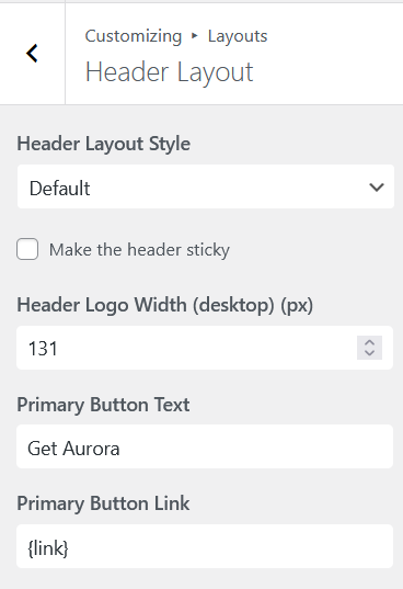
| Setting | Default | Range |
|---|---|---|
| Desktop logo width | 80px | 40px – 400px |
| Tablet logo width | 70px | 40px – 400px |
| Mobile logo width | 60px | 40px – 400px |
Footer Logo Widths
The footer has its own logo and its own set of width controls. Go to Appearance → Customize → Layouts → Footer Layout:
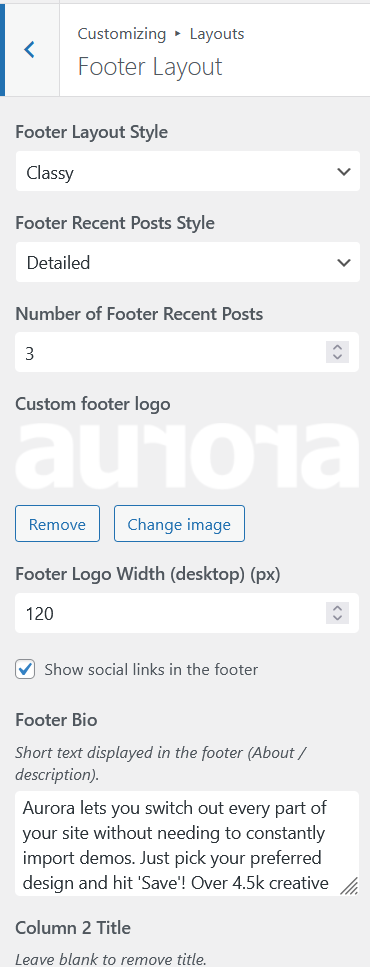
| Setting | Default | Range |
|---|---|---|
| Desktop logo width | 150px | 40px – 400px |
| Tablet logo width | 150px | 40px – 400px |
| Mobile logo width | 150px | 40px – 400px |
The footer logo is separate from the header logo. You can upload a different image for each. The footer logo only appears on footer layouts that support it; the Stripped layout does not include a logo area.
Tips
- Upload your logo at 2× the maximum display size you intend to use so it stays sharp on high-density screens.
- If your logo looks too large on mobile, reduce the mobile width setting rather than uploading a smaller image.
- The width controls set the rendered width; height scales proportionally to preserve the logo’s aspect ratio.